Designing User Interfaces for Color Vision Deficiency – CVD
Intelligent design must take into account many aspects including the importance of:
Color Vision Deficiency (CVD) and its implications for user interface design.
CVD, commonly but incorrectly referred to as “color blindness”, refers to a condition where individuals have limited color sensation, specifically in distinguishing reds and greens. However, it’s crucial to note that over 99% of people with CVD are not completely color blind. They may experience reduced color discrimination, making it challenging to differentiate between certain colors and shades. Therefore, using the term “color blind” is inaccurate and can perpetuate misconceptions.
It’s a Male Problem
CVD affects a significant portion of the population, particularly males. About 8% to 10% of the male population have CVD. Only an estimated 0.5% of the female population has CVD. In fact, there are approximately 300 million people with a form of CVD worldwide.
Let’s explore some key considerations when designing interfaces to address CVD and ensure inclusion for all users. To create user interfaces that address CVD.
Key strategies JMS uses when designing the latest User Interfaces.
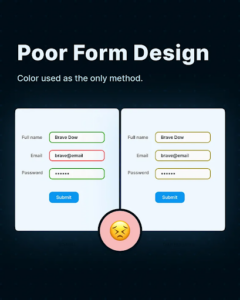
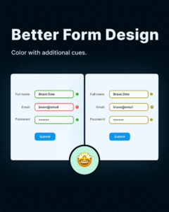
#1. Utilizing colors and symbols: Instead of relying solely on color, incorporate additional visual cues such as
symbols or icons to communicate information. For example, in a data visualization chart, use different patterns or shapes in addition to color coding to differentiate between data points. This approach ensures that users with CVD can still interpret and understand the information being presented.
#2. Avoiding certain color combinations:Be mindful of color combinations that might pose challenges for individuals with CVD. For instance, red and green are often difficult to distinguish for those with CVD. Therefore, avoid using these colors together or ensure there is sufficient contrast between them. Utilize color accessibility tools and guidelines to select color palettes that are inclusive and readable for all users.
#3. Getting the contrast right: Ensuring proper contrast is essential for users with CVD. Opt for high contrast between text and background colors to enhance readability. Use color contrast checkers to verify that your design meets accessibility standards, making it easier for individuals with CVD to perceive and understand content.
#4. Work on the primary button: While making the primary button stand out is a common design practice, it can be challenging for color blind users to perceive. Consider incorporating different visual cues such as size, shape, or text labels to distinguish primary buttons. This way, users with CVD can identify and interact with the primary actions without relying solely on color differentiation.
By implementing these strategies, we can create user interfaces that are accessible and inclusive for individuals with CVD. Remember, designing with accessibility in mind benefits not only those with CVD but also users with other visual impairments.
Understanding the nuances of CVD and avoiding misleading terminology is crucial. By utilizing a combination of colors, symbols, proper contrast, and alternative visual cues, we can create user interfaces that cater to the needs of individuals with CVD and provide a seamless experience for all users.
At Jonas Software we continue striving for inclusive design practices that empower everyone.
Author Posted
11th October 2023
Next Article
Welcome Scott Taylor Our New Chief Revenue Officer
JMS is thrilled to announce the appointment of Scott Taylor as our new Chief Revenue Officer (CRO). Scott started with Jonas Club in February 2005. He…